What is charting? This is a simple question with so many possible answers. In some ways it is easier to start the answer by defining what charting is not. A chart of price information is not a way to predict the future behaviour of the market, or of a stock. A chart of traded prices for a stock tells us very little about the financial health of a company, or the value of a company as it is related to its financial position. Although price is used in some fundamental calculations like the PE ratio, this has nothing to do with the way a price chart is used.
The single most misleading and false idea about charting is that somehow it is able to predict the future. It is an idea repeated endlessly by those who know little about charting. People new to the market who accept this idea are sent off on a fruitless, and sometimes very expensive, chase in search of the method that allows them to predict the future.
So what is charting? It is simply a graphical record of the traded price for a stock during the day. The simplest display is a line chart which usually shows the closing price for each day. This is useful as a way of seeing how price has behaved over the previous weeks or months. The display gives a broad outline of the direction of the trend because we can see if price is generally moving up or down.

Stocks have four significant trading or price
points during the day. First is the opening
price and last is the closing price. In-between
times we are interested in the absolute high
price for the day and the absolute low price for
the day. The basic chart display uses either a
bar chart or a candlestick chart to display
these four price elements open, high, low and
close.
The bar chart starts with a small horizontal
mark, or bar, for the open. The vertical line
connects the high and the low for the day. The
horizontal bar on the right of the vertical line
shows the closing price for the day.
Which you decide to use is a matter of personal
preference. Candlesticks are particularly useful
when used with certain types of pattern trading
approaches. When they are combined with many
other analysis techniques, there is no
significant difference between candlesticks and
bar charts.
These four elements of the day's trading are
very useful because they capture the essence of
what a chart tells us about the market. Although
the chart records the accurate and objective
prices paid for the stock, it also captures the
emotion of the crowd of people who traded on
that day. It also captures the emotions of those
who did not trade because their inactivity tells
us something about how high or low prices must
go before they become active.

Every price has an emotional content. If we
buy a stock for $1.00 and it rises to $1.30 we
feel very smart. If later in the day it falls
back to $1.00 we feel rather silly because we
have missed a 30% return. We may believe we are
rational when we buy the stock, but we become
emotional as price moves and delivers a profit,
or a loss.
The movement of share prices tells us something
about the emotions of the crowd of people who
have traded the stock during the day. Those who
believe the stock has a very bright future help
set the high for the day. Their bullish
enthusiasm means they simply want to buy the
stock – at almost any price. A trading day where
the close is the same value as the high for the
day tells us the crowd is very bullish. A day
when the close is the same as the low tells us
the crowd is bearish. Sellers are worried about
the future, so they sell stock at lower prices
just so they can get rid of it.
The price chart tells us first about the
emotions of the crowd. It does not tell us about
the health of the company, its true value
(however that may be calculated), the quality of
its management, or the importance of its product
line or services. The price chart does tell us
what other traders and investors think about
these aspects of company behaviour.
It is this feature of charting that captures the
difference between price – what we pay for a
stock – and value – what we think a stock is
worth. The price chart helps us understand the
emotions of a crowd and when we get a crowd of
people together they start to behave in
particular ways. This gives us the most
important step in understanding a chart of price
activity and making it work for us. The chart
illustrates the probability of future price
activity. When crowds start to behave in
particular way then we know that they are most
likely to continue behaving in one way rather
than another.
The difference between probability and
prediction is very important. A chart is used
effectively as a probability tool.
We know how a crowd of supporters will behave at
a sporting match. They will shout and roar when
a winning point is scored. We cannot tell when
the winning point will be scored – prediction –
but when do know how the crowd is most likely to
behave when this happens – probability.
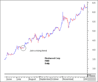
The price chart of Fleetwood Corp can be
understood as a graphical representation of the
most likely course of price action. If we buy
Fleetwood in July we are joining an established
trend. It is most likely – most probable – that
this rising trend will continue for the next few
days, or weeks, or months. We cannot predict
this for this tells us that something must
happen in the future. We can say that the trend
is most likely to continue to rise. Probability
allows for mistakes, in this case a trend
collapse. If we know there is the possibility
our analysis is wrong then we can plan for this
eventuality. This is the first step in effective
risk management and this underpins every
successful trade or investment.